Packaging design at Designworks
Whether it’s an innovative solution to pack one of our latest design creations, or a carefully considered, alternate solution to upgrade an existing design; packaging design has been a core part of Designworks business for decades, ever since our inception in fact.
Recently we took a look around our server and hand-picked some favourite jobs from over the years.
Presentation
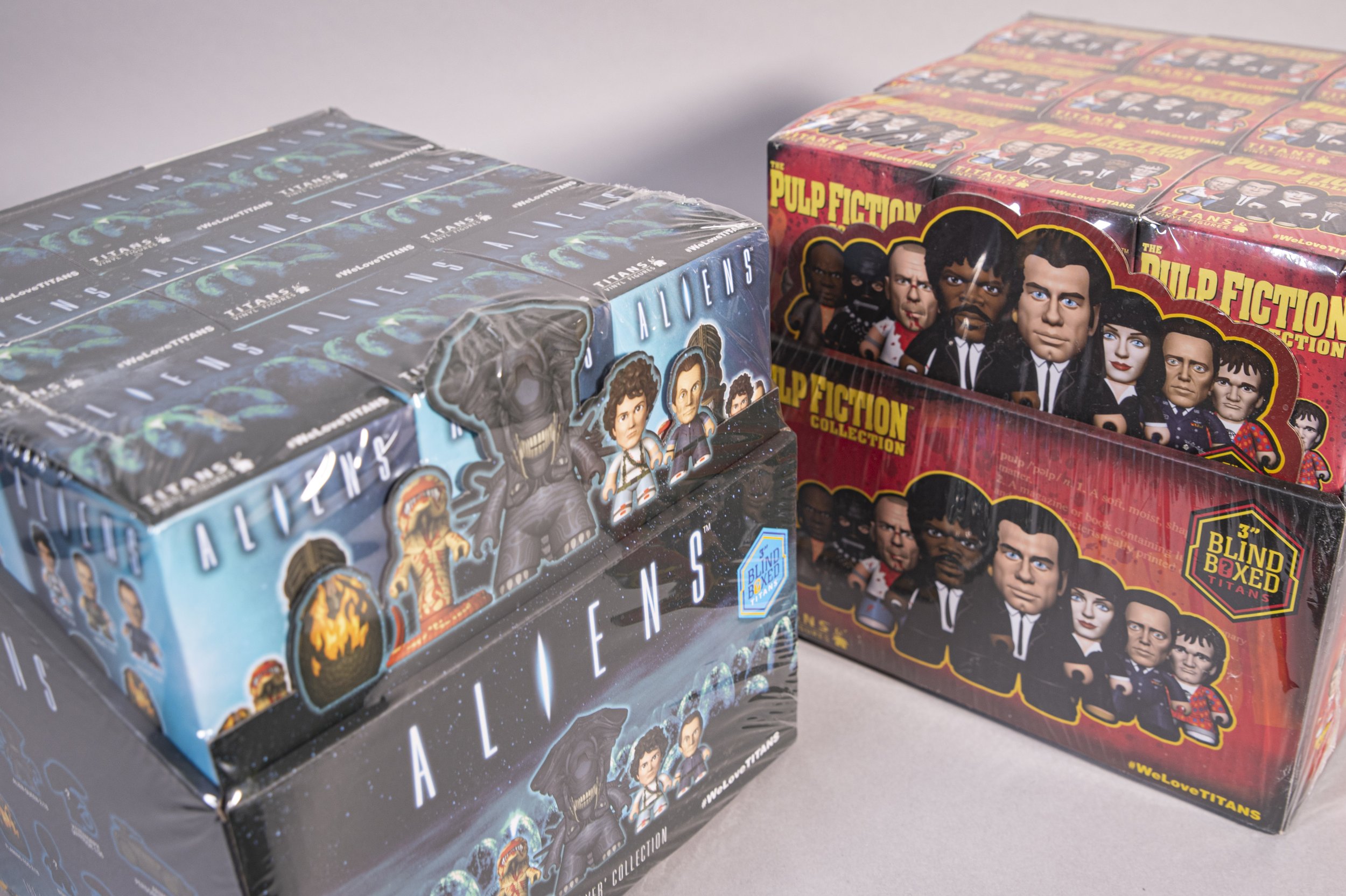
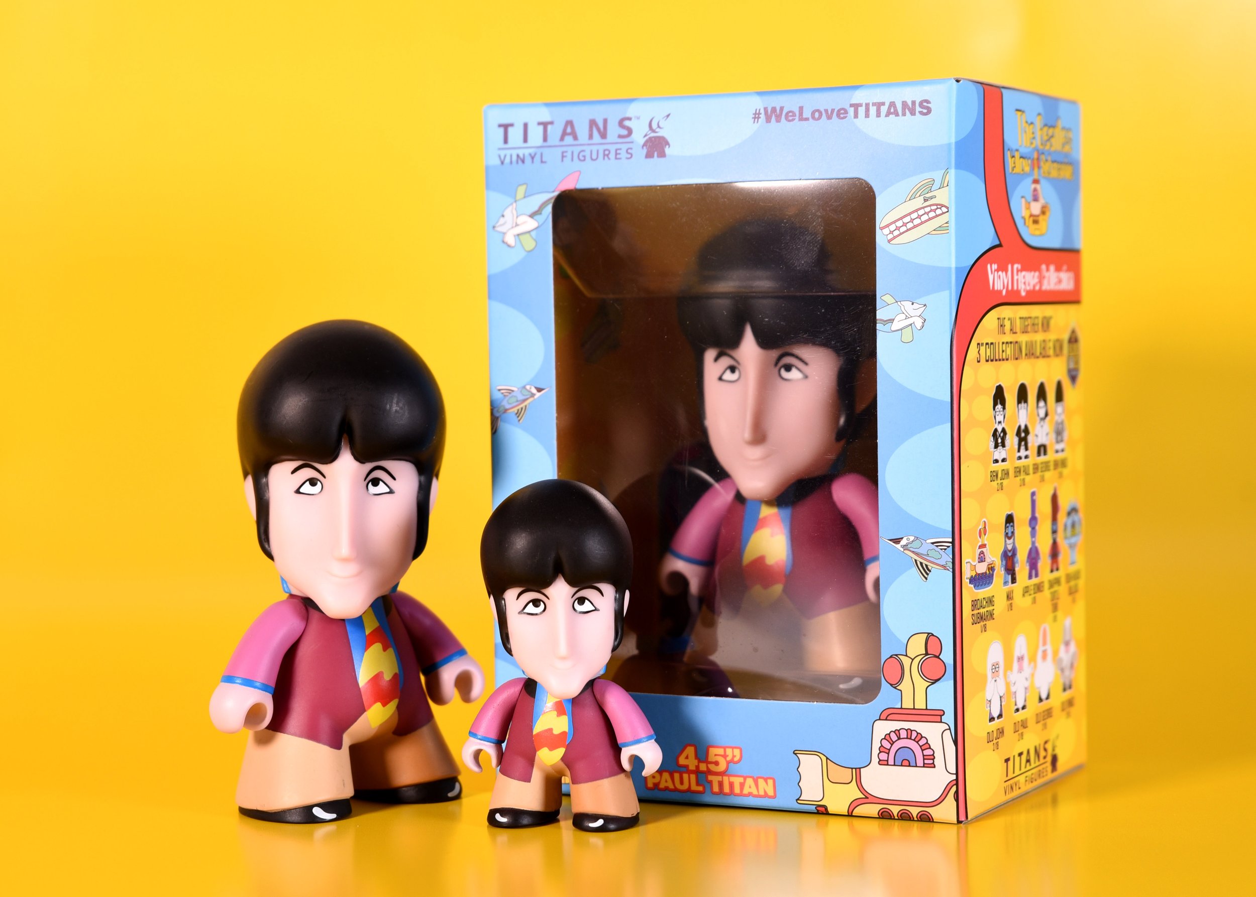
Nothing beats the real thing, so for the larger Titans vinyl art toys a window displaying the actual product allowed the customers to see the cool sculpts and all of their subtle deco operations in all their glory. By contrast, the more common 3” size Titan came blind-bagged for collectability, so the packaging graphics needed to carry the whole weight of communication, with a cutout character line-up to indicate some of the possibilities waiting inside.
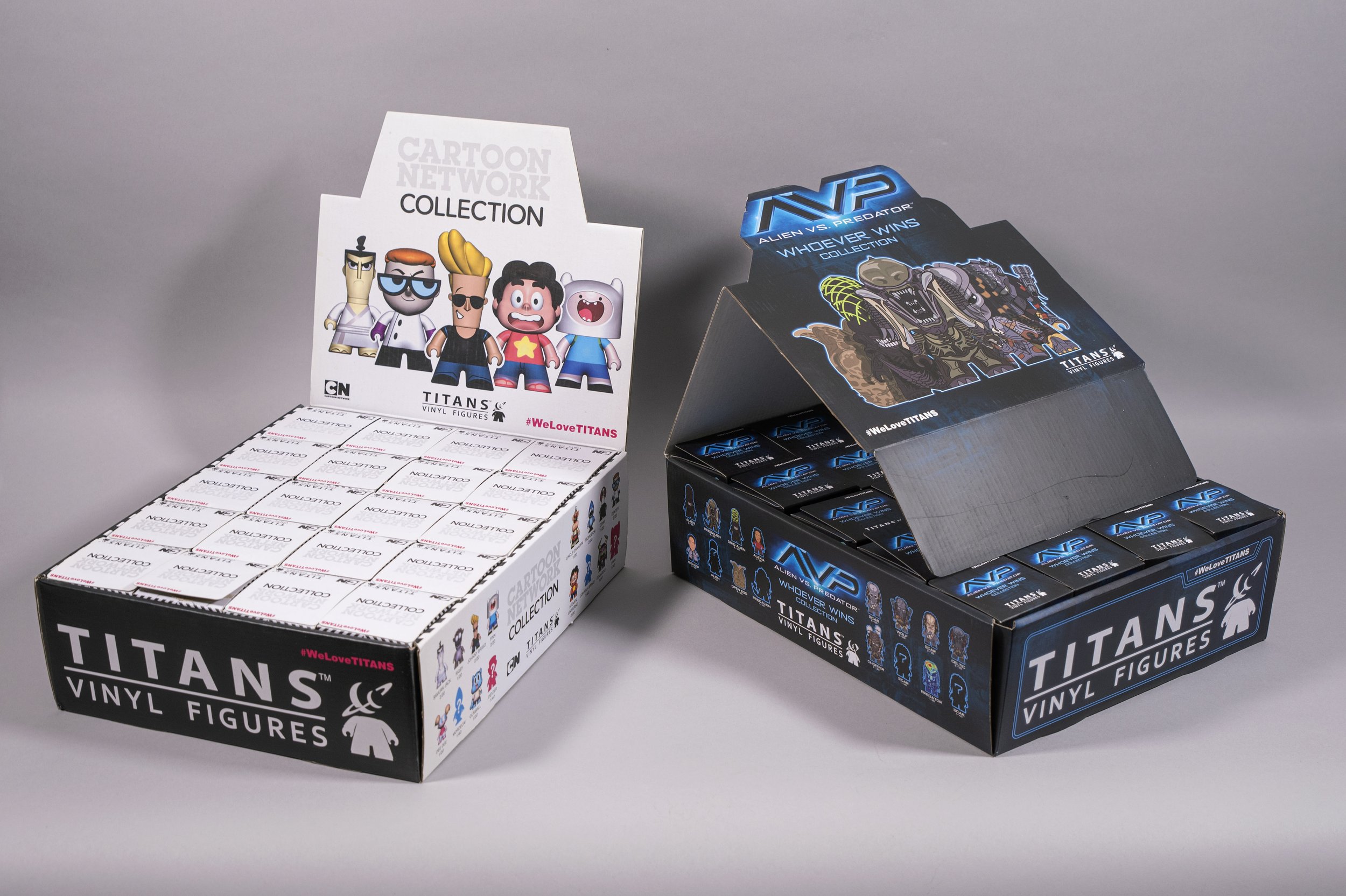
For other ranges, designed for shop presentation, the top lid of the retail-ready box folds up into a standee allowing high visibility across the shop floor. Serving a valuable secondary use, the once protective packaging morphs to become a presentation stand. The complete instore, small advertising billboard.
Experience
Whether it’s the simple satisfaction of slowly pulling the tear tape on a perforated envelope, or the refreshingly clear pop of a vacuum sealed beverage, the careful consideration of the opening and unboxing experience can add a bit of free value to any pack. With this in mind our solution for the 2023 Red Nose Day box, commissioned for AmazonUK, created surprise and delight when the outer top lid was lifted. The leaf-like internal sides gracefully folded down revealing both the explanatory information and the product itself in all its glory.
Identification
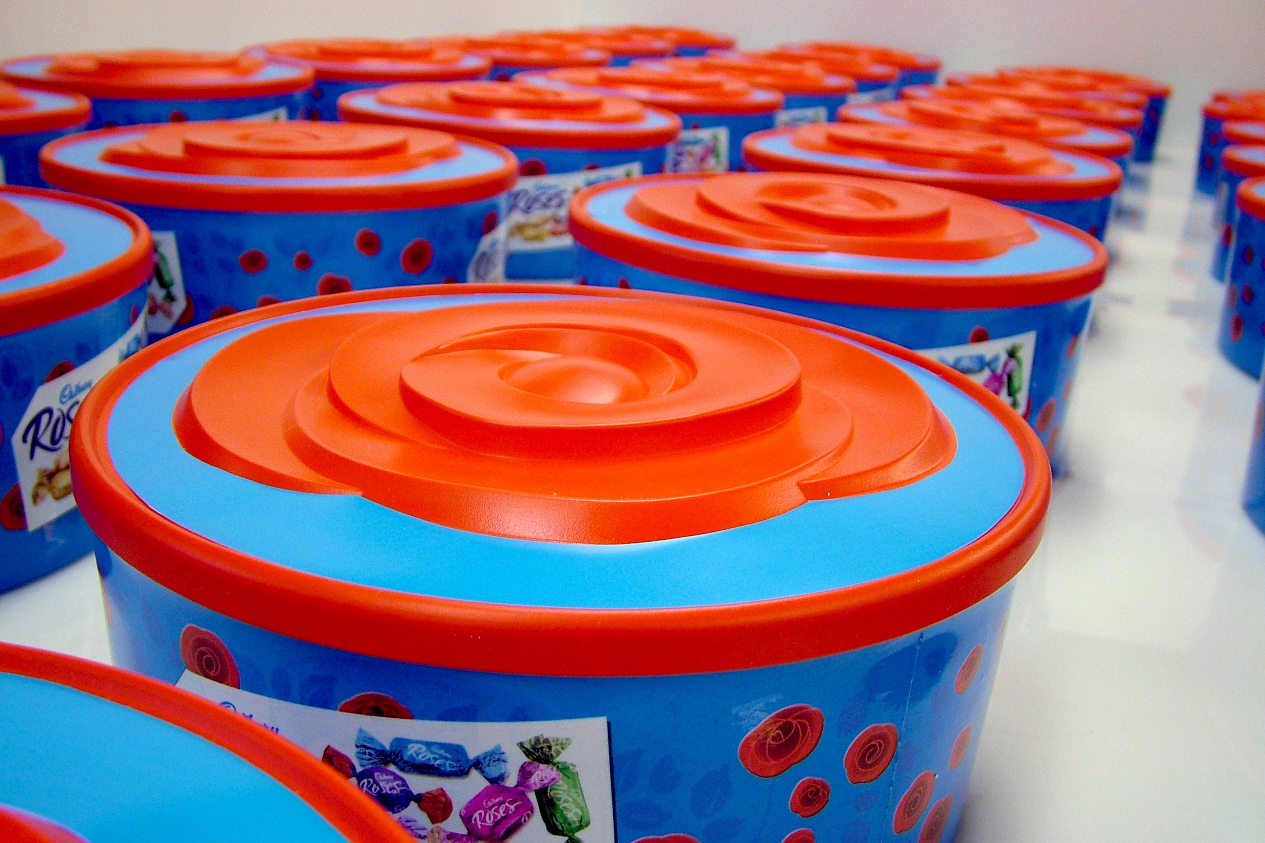
From red noses to red roses, designing and sculpting the relief lid for the famous Cadbury’s product was really fun, to bring a bit of tactility to a classic family brand.
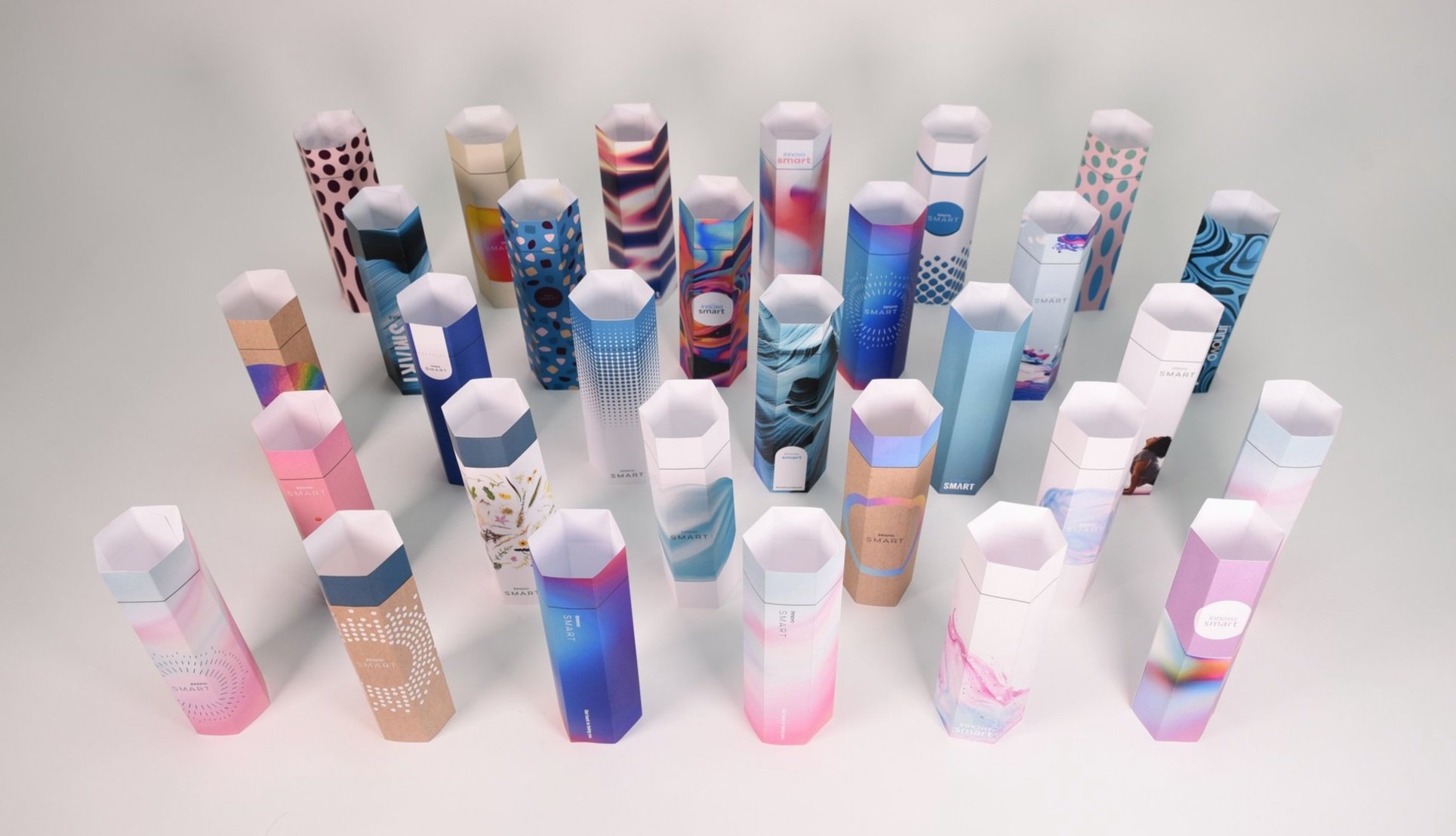
Where the chocolate box lid portrayed a logo, and the Red Nose pack was to follow the familiar look of Amazon shipping boxes, for new products there’s the opportunity to start to define the look and feel of the brand ourselves. For Innovo we got just that chance and delivered concepts defining both the graphic design and innovative structural packaging approaches.
Information
Staying with medical devices, we developed the packaging to accompany our latest design for the U-Rhythm device. A range of distinct accessories that supported the system were individually boxed with clear, straightforward illustrations of the contents. Neatly fitting together, each internal box had its own place in the outer box, named, indicated and accompanied by a table of contents to help identify and signpost them all.
Retention
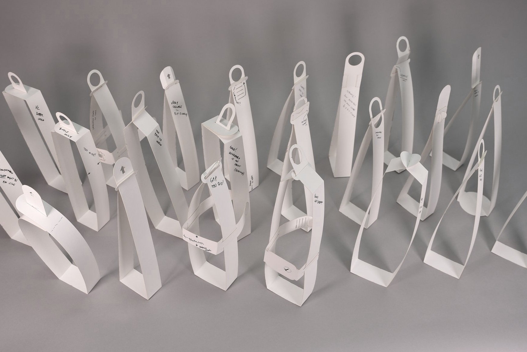
This useful device, designed for Johnnie Walker was primary packaging for one of the slipperiest things around, water. In use, licensed venues filled them, froze them, then at the time of purchase could unwrap a pristine, large sphere of ice for customers to enjoy in their whisky. The way Jonnie would have wanted it served.
Protection
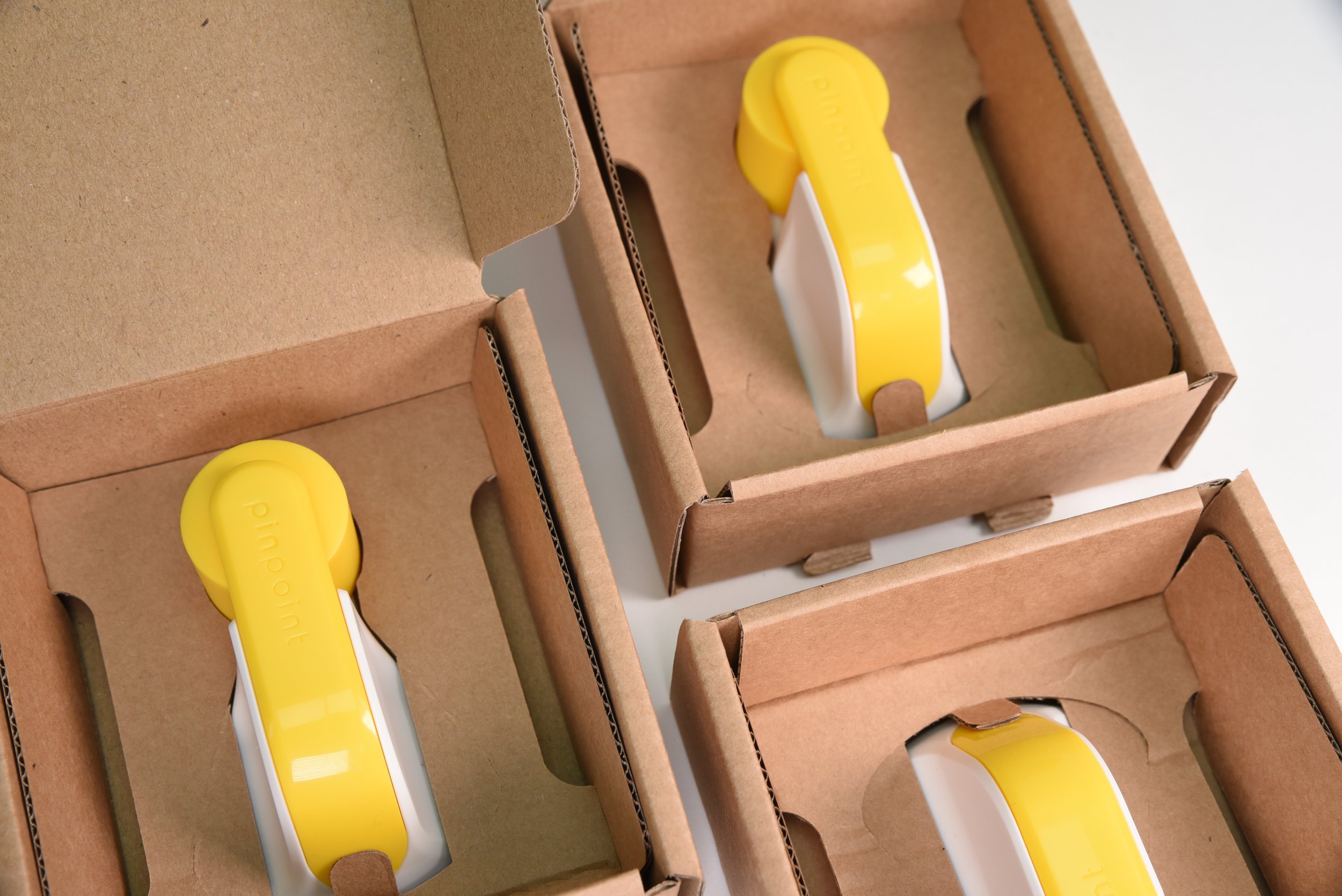
Finally, but arguably most importantly, we move to protection. The fluted board box created for Pinpoint was built for strength for shipping by post, but at a very low cost. We were able to use our laser-cutting facilities to rapidly develop and test prototypes in-house.
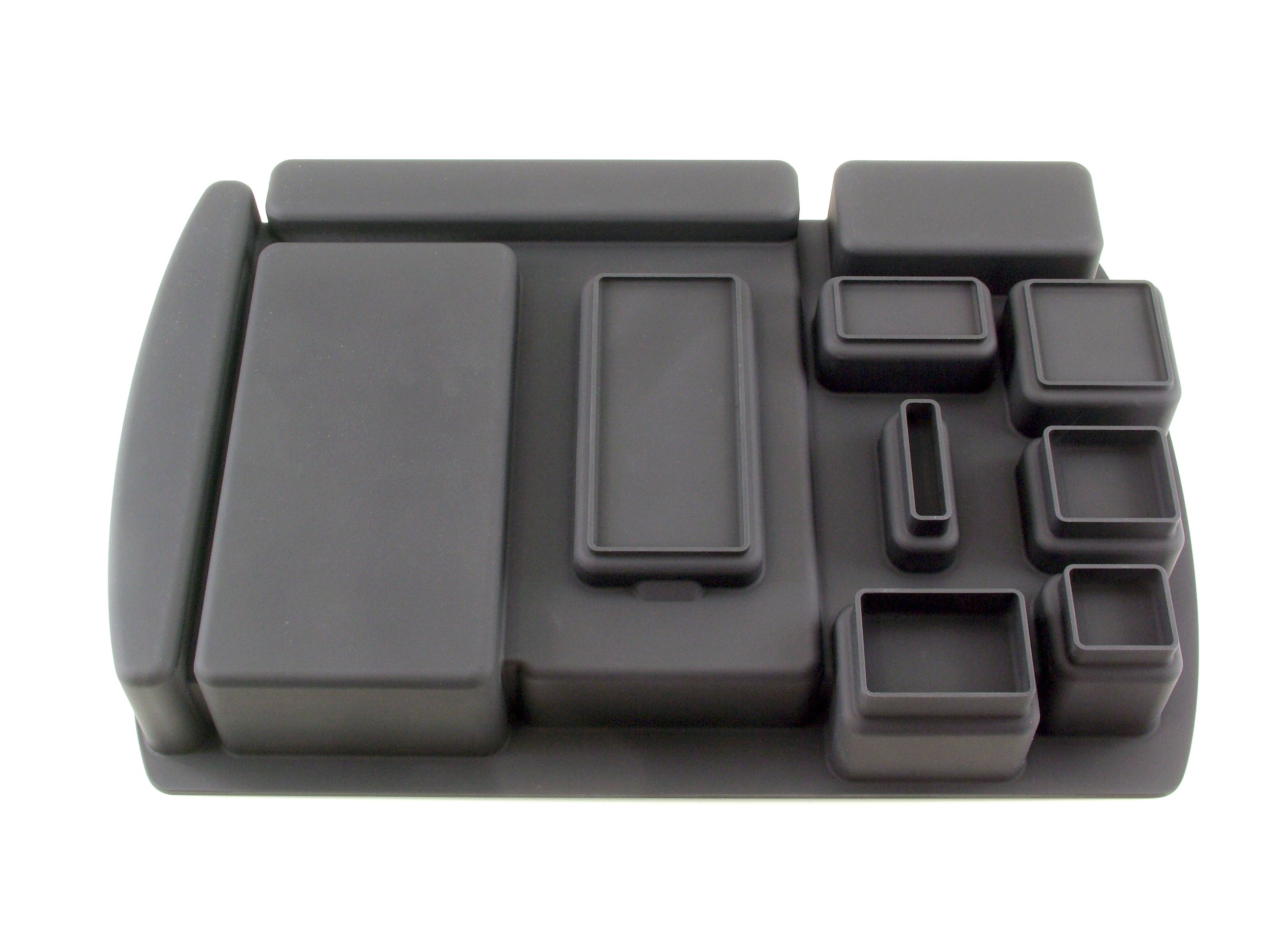
At the opposite end of the cost scale, our cases for Vertu employed TPU inserts to offer the high impact and scratch protection required, keeping their premium, luxury handmade smartphones safely stored inside.
If you have a current packaging request, or your existing solution is ready for a refresh or rethink, get in touch with our team below…

